Designing website can be as hard as a rock. When it comes to planning a design that boosts the content of a website and provides revenue, many businesses faces struggle. The website needs to be much attractive and appealing with fruitful content. The ordinary mistakes in website can be subtle but they create a lot of damage. The errors create problematic situations for customers to buy and face problems unnecessarily.
If a website needs to be working, the amount of traffic must be increased by simply avoiding the errors that others make. With constant and regular effort, one can dramatically increase the amount of sales and leads on one’s own website produces. The identification of the mistakes can sort out the problems.
Let’s go through some of the mistakes:
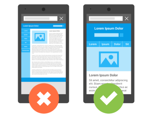
• Not Responsive: Responsive design is the most important feature of a website. As mobile users account for 53% of all internet users, it is therefore mandatory that the website works on all devices. The responsive design feature makes the website more accessible and attainable regardless of any device. Users taking glimpse of the website on desktops, iPads or PS4s have a smart experience that is optimized for their device via Google recommendations.
While constructing a website, Google supports configurations like:
a. Sites that have responsive web design that is sites that serve all devices on same URLs with each URL having same HTML and using CSS to change the rendering of the page.
b. Sites that serve same URLs but each URL serves different HTML depending on the agent that is desktop or smart phone.
c. Sites that have separate mobile and desktop sites.
b. Sites that serve same URLs but each URL serves different HTML depending on the agent that is desktop or smart phone.
c. Sites that have separate mobile and desktop sites.

- Web Accessibility: Web accessibility prevents barriers and helps in communication and access to websites on the Web by the users with disabilities. Technically speaking, the users can perceive, navigate and contribute through web. Accessibility isn’t difficult to implement but a slight change in the design can make the website unattractive the users. The website must be keyboard friendly and all content must be easily accessible to the user. The notion of automatic media navigation and choosing suitable colors makes the site more obtainable and user friendly.


- Favicons: Favicons are small images which are used by web browsers to show a graphical representation of the site that is being visited at the left side of the browser’s address bar. Many website users prefer to use lots of tabs while they’re browsing. Some users keep tabs open to review later. Favicons give the users the visual representation they need to orient them, search what they’re looking for, and return to the user’s tab while they’re browsing. So it is highly important to make a note of the favicons while going for designing sites.

- Slow Website: The approximate time to load a web page is four seconds. If it takes more than that, the web page is considered to be slow. According to Google, 70% of the sites took six to seven seconds to load, the slower the site, the more likely the user is to bounce. Moreover, the web page can impact the rankings. Google uses various metrics to ponder site speed. They are Time to the first byte, Visual completeness, rendering, completion of document and the number of file requests. Therefore, slow websites can make it less impactful in the market.


- Poor SEO: SEO is important to any website, but many don’t realize that search engine optimization needs to be built into the web design process in such a way that attracts visitors. The SEO friendly site allows one’s search engine to explore and read pages across the site. Through the search engine, one can easily understand the content in the search engine result pages. The search engine uses a web for this but the real issue is there are many ways to make a website, and not all technologies are built with SEO in mind. Building an SEO-friendly site is hectic as it requires careful planning and a structured approach to representing one’s business and the services one provides. The main elements that set the stage for a better website design are Domains, CMS and Host. Hence, SEO must have a pretty good idea about the page that builds on solid foundation that is laid out by content and site structure.


- Using too many conflicting fonts: Using too many fonts and styles creates perplexity. Visitors get easily content they must be focused on the message the site is trying to convey. The changing of fonts decreases cognitive fluency and breaks the focus. The website seems to be appealing but using lots of fonts and styles makes it gallimaufry. Again, using many fonts is a bad idea if the fonts conflict with each other. Conflicting fonts drives off the attention taking the focus away from the important parts of the main message.


- Poor use of whitespace: whitespace in a site increases comprehension, improves readability, increases attention, and maximizes clarity. When there isn’t enough whitespace, the content becomes enormous for users to read. Whitespace is important for a site and Google uses whitespace to focus their user’s observation on what is most important.


- Poor Content: content marketers who are inexperienced just focus on their business and completely forget about the user’s main motives and problems. This decreases credibility and the user is dissatisfied. Another major issue arises when the user finds the content isn’t scannable. The user seeks for some structured content with detailing like descriptive sub heads, short paragraphs, bullets and bold points. This kind of content is easy to scan and far more readable. Also the content sometimes struggle with grammar errors which is problematic. It erodes the site’s credibility and makes terrible impression.


Conclusion
The list is long while creating a perfect website but it will be a great start if worked upon in a structured form. When it comes to creating a design, it drives a lot of traffic and creates a lot of revenue and thus most businesses struggle. They opt for simple tricks but make silly mistakes. Creating an attractive website is predominant but the main idea lies in making money. Knowing the audience is the utmost goal and focusing on the things they want becomes the motto. Designing website is not rocket science; with prolific work one can master it efficiently.
The list is long while creating a perfect website but it will be a great start if worked upon in a structured form. When it comes to creating a design, it drives a lot of traffic and creates a lot of revenue and thus most businesses struggle. They opt for simple tricks but make silly mistakes. Creating an attractive website is predominant but the main idea lies in making money. Knowing the audience is the utmost goal and focusing on the things they want becomes the motto. Designing website is not rocket science; with prolific work one can master it efficiently.
No comments:
Post a Comment